The Future Starts Here
Victoria and Albert Museum
Exhibition Road, London SW7
12 May to 4 November 2018
Symposium, “A Toolkit for the Future”, 29 June 2018
I’m a little tired of the future, perhaps because my doctoral research requires me to think about “the future of design museums”, but also I’m old enough to recall another time when the future was centre stage; back when we worried that the Millennium might put a bug in it I edited a book with “future” in the title.* Contextualising our current future obsession (see Nesta’s Future Fest) I teach a semester of Cultural and Critical Studies lectures and seminars to Visual Communication students at University of Brighton, “Visions and Versions of the Future”, where we look at significant moments and sites of post-war design culture, from the white-heat of technological progress to the anti-design roots of Postmodernism, alongside the imagined futures of science fiction, the smoke and mirrors of future-gazers and the commercial hocus-pocus of trend forecasting. The crux of the argument is, we may imagine multifarious futures but they are often prophetic, based on hints, hunches and the cutting-edge of disciplines, so it’s often just a matter of time before we catch up with our imaginations. That (hopefully) runs counter to the prevailing tendency of seeing the future as strange and difficult, whether utopian or dystopian, always out of reach and therefore beyond our capacity to influence or change; that version of the future which got us to the dangerous situation we are in now…
The Victoria and Albert Museum’s current exhibition about the future, The Future Starts Here, goes for the realistic and relatable approach, although I had a moment of déjà vu with the title. Oh yes, London’s Design Museum suggested The Future is Here with its exhibition in 2014, which I blogged about, here. Beyond that niggle, this exhibition delivers.
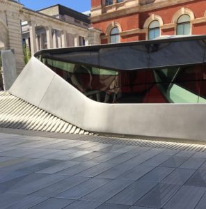
As the opening show in the new Sainsbury Gallery, a new venue for temporary exhibitions, located below the eye-popping (in a good way) Exhibition Road entrance designed by Amanda Levete Architects (AL_A), it was required to make a bold statement. It’s particularly interesting for me as this regenerated space was the site of the Boilerhouse Gallery, the precursor of the Design Museum run by the Conran Foundation from 1981 to 1986, which I have been researching as part of my doctorate; a recent talk about it is posted, here. (I posted about The Design Museum’s opening shows, at its new Kensington location, here).
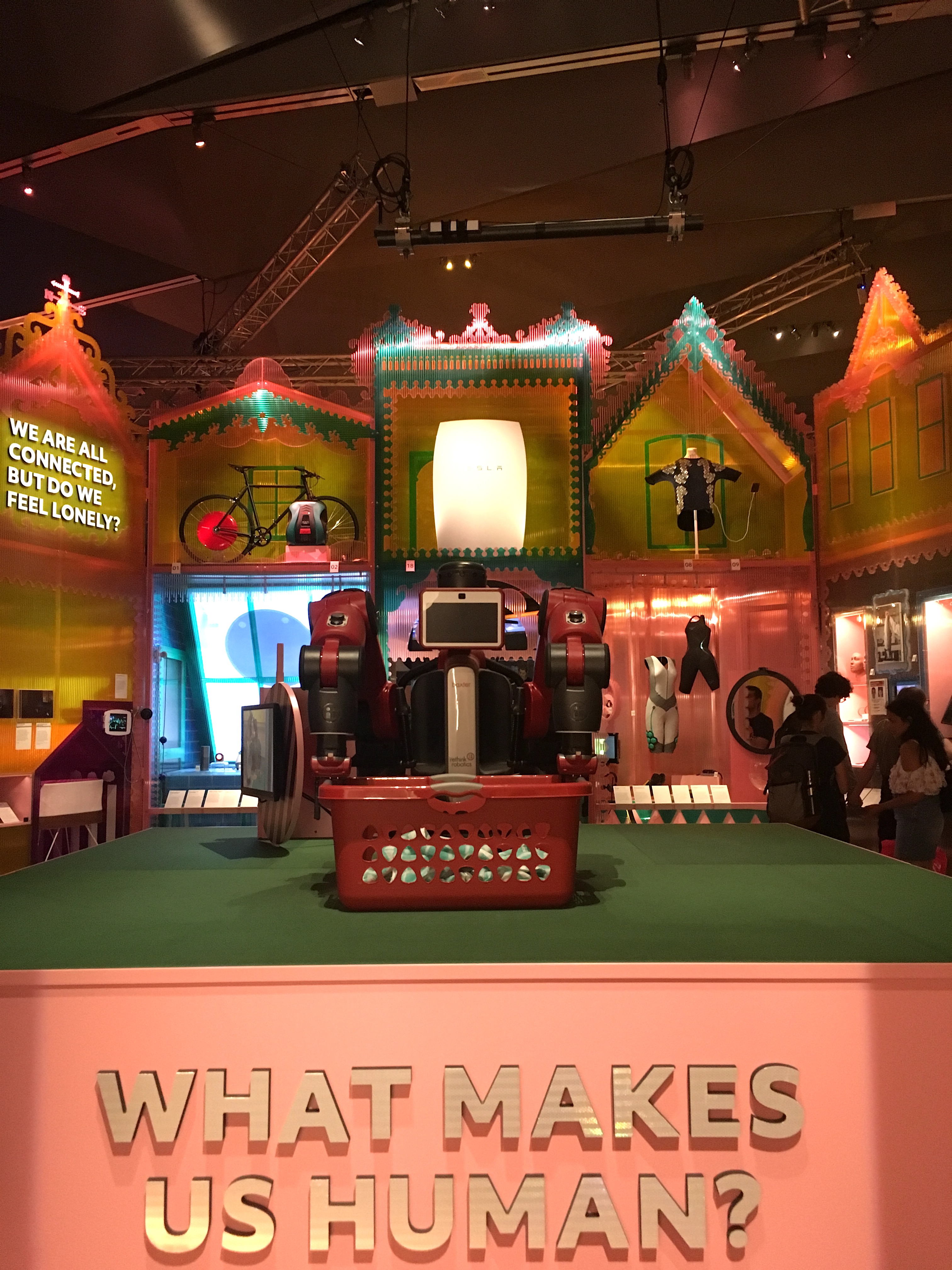
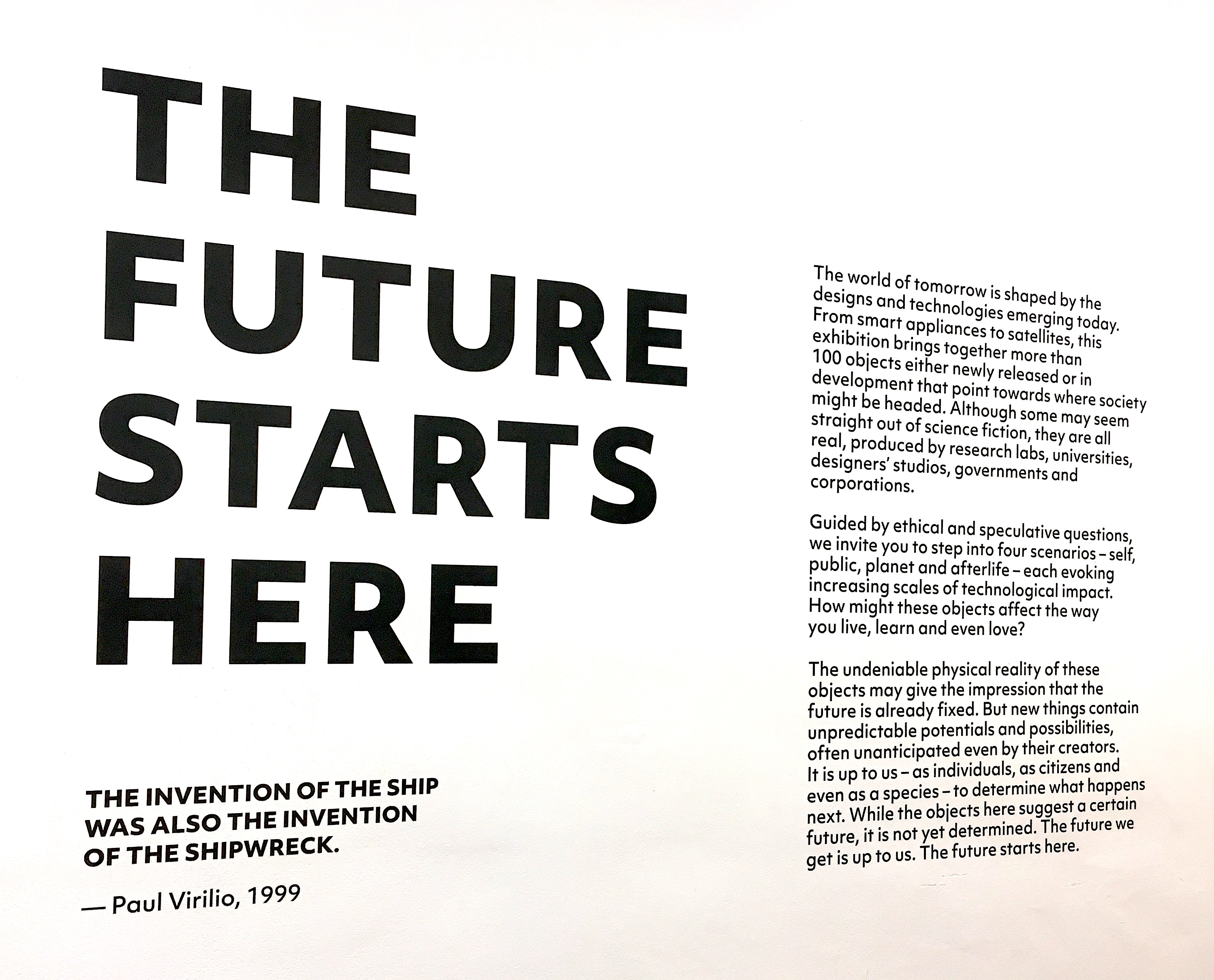
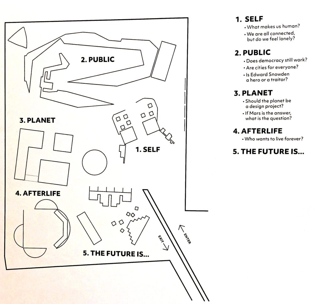
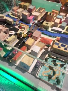
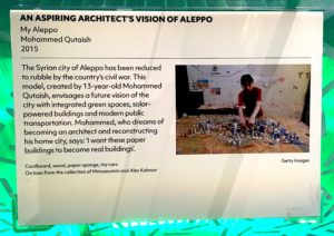
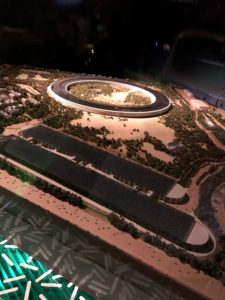
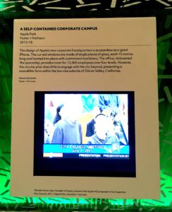
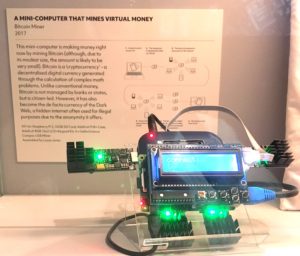
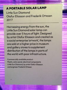
Adopting the organising principle of ‘100 objects’, made familiar by Neil MacGregor’s A History of the World in 100 Objects, the curators of The Future Starts Here selected exhibits that they judged would significantly impact our everyday lives, with the proviso that these objects and projects either currently exist or are in development. The curators asked, if these become the norm, how would they look in real life? To that end, the exhibition design mixes dioramas with filmed fictions and installations that feel like 1:1 models of future environments, using a creative palette of materials and technologies. Curated by the Design, Architecture and Digital team, which deals with Contemporary Design at the V&A (which I posted about, here), their subject specialisms are mapped onto four themes, Self (individual and home), Public (citizen and politics), Planet (species and environment) and Afterlife (not sure I get this one…legacy perhaps).
I visited the exhibition after a day-long symposium that featured talks by a number of individual exhibitors, so my experience of their projects came via verbal explanations before I saw the display. I’ll report on the symposium too, but first, I want to reflect on the exhibition itself, including the design and interpretation.
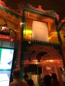
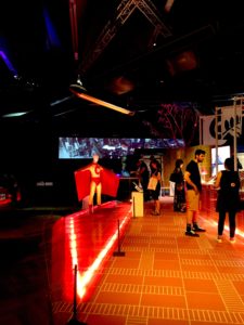
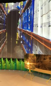
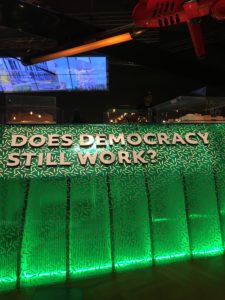
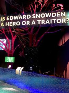
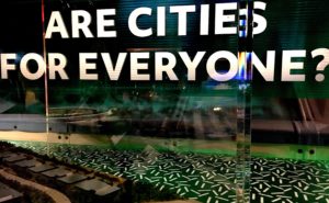
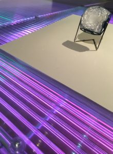
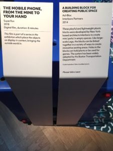
Within a large, black-painted space this exhibition is immersive. Quite contrary to the conventional “white cube” of an art gallery, it is more like a sound stage where the visitor is presented with zones. A distinctive atmosphere is created and controlled using a palette of materials that play with transparency and reflections, mixed with vary-sized screens and back-lit signage asking some big, literally, questions. Each zone is like a “themed ride” with a unique display format creating a route that modulates how the visitor interacts with the exhibits, offering, for example, close-ups and sequences.
Unlike the seamless luxe of more traditional museum displays this feels both ephemeral and dynamic, a DIY-maker-space meets sci-fi-movie-set; the shock and awesomeness draws the visitor through the zones, while the variation in materiality and scale make you stop, look, read, and listen. The staging brings to mind Boilerhouse Director Stephen Bayley’s description of design curation as ‘three-dimensional journalism’, peaking the interest of the visitor while avoiding information overload, the aim being to encourage even the most casual viewer to further explore a subject beyond their visit.
The curatorial and design team have pushed the exhibition format, to educate and entertain by presenting a creative mix of objects, models, graphics and audio-visual versions of projects. The labels are well placed, the text and tone is engaging, posing questions that promote critical thinking rather than fandom. The contextualising films aren’t too easy to see or hear though. Clips of the creators talking to camera might have added another layer of interpretation but would, perhaps, have been too suggestive of ‘the now’, undermining the ‘futuristic’ narrative.
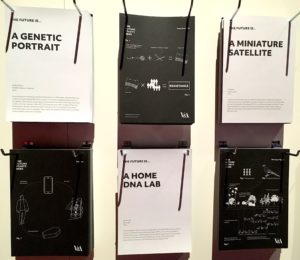
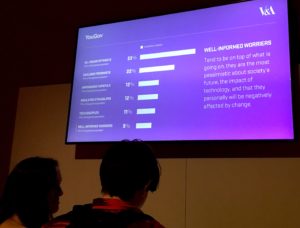
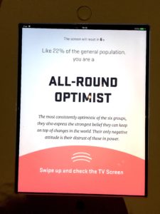
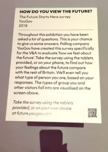
While the staging was dynamic and inventive, at times I wanted more information. Perhaps placing reference copies of the catalogue in the exhibition space would be one solution, but at the end of the show I found a wall of info sheets replicating the labels, for visitors to “take-away” the essential info, as a prompt to further research. Feedback was encouraged too, in a number of ways, including an interactive exhibit, a touch screen questionnaire. However, providing a statement about how collected information will be stored and used should be a prerequisite for including an interactive of this kind.
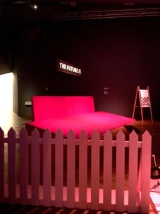
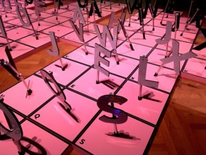
Another issue were the low light levels that although used to dramatic effect also produced some dead corners containing exhibits that looked as if they might come to life during scheduled demonstrations but were mostly dormant. Using such spaces as reading, listening or viewing nooks, beyond the designated route, would have provided visitors with an opportunity to sit and process the exhibition, perhaps extending their stay. To that end, a cushioned seating area under a domed screen was very popular, more so than the bright pink “selfie stage” with giant letters for spelling out a message, which had no takers during my visit.
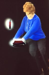
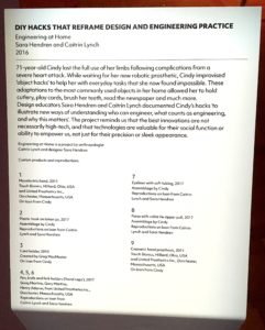
Unlike in many temporary exhibitions, where copyright issues disallow photography, I was able to document this exhibition with images of the design and interpretation, as well as the exhibits relating to the speakers at the symposium. One particular exhibit, though, was truly revealing. Mixing audio-visuals with objects, in the “Self” category but presented apart from the two-story “house”, I discovered it near the end of my visit. Using up-to-the-minute technology it showcased the image of a middle-aged woman, making it both magical and relatable. “Cindy” was represented as a life-sized projection picking up and using a series of objects to demonstrate the life-hacks she had adopted to aid dexterity. The display stopped me and other visitors in our tracks. When the video sequence was progressing to the next object, Cindy’s moving image momentarily disappeared. Suddenly, a guy next to me began jumping around hoping to set off a motion-sensor, thinking the image had faded because the audience was standing still. Nothing happened and he walked away, but seconds later Cindy manifested again but in a different part of the display. What that revealed to me was the consistency of interaction that we expect, and how easy it is to frustrate and even embarrass a visitor.
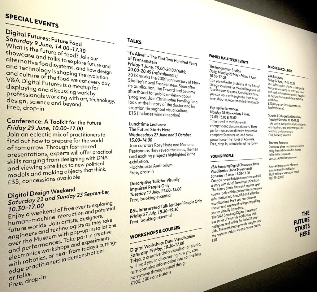
Returning to the idea of “three-dimensional journalism”; an exhibition is a site for initiating interest through exposing the visitor to multiple stories. This is in no way a criticism of The Future Starts Here, but to deepen and widen those narratives is the role of the catalogue and events programming. Not every exhibit will resonate and that is the beauty of the medium; the visitor has agency in deciding their ‘take away’. That said, catalogues and events plug the gaps adding back stories to exhibits, making them more relatable and engaging. To that end, here’s a round-up of what I got from the day-long symposium.
“A Toolkit for the Future” was introduced by curators, Mariana Pestana, Rory Hyde and Zara Arshad, explaining that the Museum stage events around exhibitions to provide an opportunity for discussion and documentation. The audience was asked to consider the “ethics of the probable and the ethics of the possible” in relation to the future. Speakers had been invited to ‘disrupt’ and were paired in order to address provocations: “Where are Technologies Produced?” was discussed by An Xiao Mina of Harvard University and Matt Jones, Principal Designer at Google AI; Jonas Staal, founder of the New World Summit, and Kei Kreutler of Open Space Observatory considered the “Politics of Ground and Skies”; artist Heather Dewey-Hagborg and biochemist Bethan Wolfenden asked “Should We Democratise Technology?”; finally, Luiza Prado of Decolonising Design along with Anab Jain of Superflux and the University of Applied Arts in Vienna were ‘Imagining Alternative World Models’.
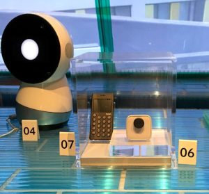
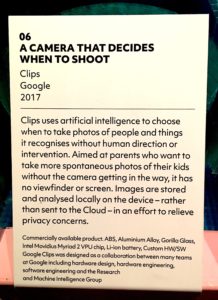
An Xiao Mina turned the tables on a now familiar nomenclature to discuss “the things of the internet”, meaning memes including object memes, the result of “decentred, componentised production…intentional, shared making, circulated and remixed”. Found in the Chinese city of Shenzhen, the ‘Silicon Valley of hardware’, she posited that “shanzhai” products are game-changers; “the same ecosystem that gives us the very trivial (think fidget spinners) gives us very useful products too”, and in the process reconfigure the process of design, production and distribution. By contrast, the self-proclaimed ‘privileged white male’ from Google, Matt Jones (previously of BERG) presented a new product, Google Clips, that gives nothing away; a sealed box camera uses machine learning to preempt the user’s desires, taking photos and videos that it predicts will resonate with the viewer. Rather than connecting back to the internet/cloud, with all of though privacy issues, the device learns from stored data, which is faster and more energy efficient. The irony seemed to be lost on Matt though, when he stated that the device would “look and listen” in order to anticipate what ‘the human owner would enjoy, such as kids, faces, pets’. He hailed the new era of “cognification”, suggesting we are where electrification was in the earlier twentieth century.
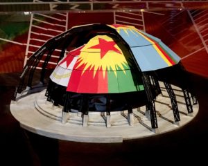
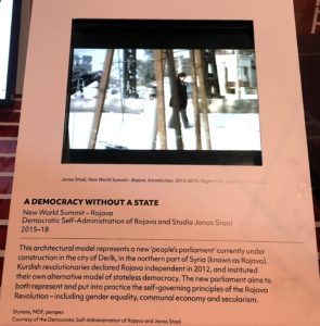
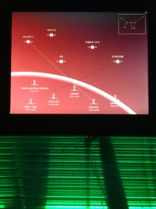
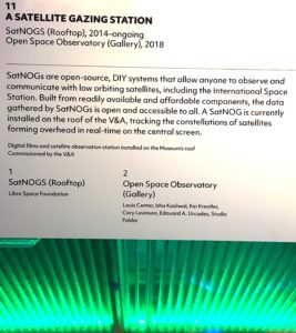
The next speaker, Jonas Staal, coming from the opposite end of the ideological spectrum, strenuously advised that “predictive anything” linked to facial recognition should be avoided; that using machine learning to predict and therefore circumvent human behaviour, even something as seemingly prosaic as completing our emails in the name of efficiency, destroys the nuanced diversity of human communication, and stated that the current incarnation of ‘propaganda would be unthinkable without the algorithms that can describe and predict our future’. Jonas bases his comments on historical research of propaganda, citing Gramsci’s theory that the “prefigurative power of art and culture has real political power”, an idea now recognised by both the Left and Right. Jonas introduced the New World Summit, a project to create temporary parliaments, embassies and democracies for stateless populations that recently built a public parliament in Rojava, northern Syria. His take-away: “Naming facts is not enough, we need infrastructure that reclaims and redistributes power and makes popular and experimental propaganda”. Kei Kreutler’s project, the Open Space Observatory, goes a long way to take back power. “The easiest way to learn about an industry is looking at its trash” suggested Kei before explaining that it is possible to build a satellite tracking station from open source technology. Citing the transformative power of the iconic Earthrise image (a photo taken in 1968 by astronaut Bill Anders), which has been credited with kick-starting the environmental movement, Kei wants us to imagine new narratives in order to reclaim space from military and commercial colonisation; by co-opting current systems, increasing accessibility, making transparent, experimenting on a small scale, employing hybrid alliances, Kei sees a new future for space.
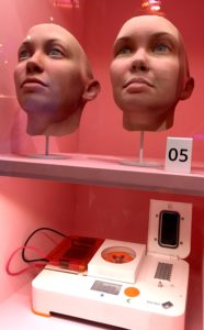
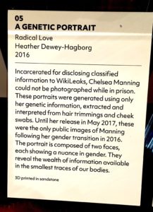
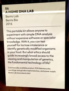
The afternoon began with a warning from Heather Dewey-Hagborg, “your data is out there”, in the form of biological matter used by health professionals, which we have no control over once it is taken from our bodies. Heather is raising awareness about the implications for own “genetic” privacy in discussion while “democratising technology” with Bethan Wolfenden of Bento Bio, who compared the evolution of the biology lab with the history of computing. Bethan suggested that a change similar to the increase in power and availability of digital computing that radically transformed communications over the last few decades (as predicted by Moore’s Law), is about to hit the biosciences, in the process the site and size of scientific and laboratory equipment will change, becoming available to a much wider community of users.
The final team of speakers foregrounded the future in relation to design and cities. Luiza Prado introduced her practice as an artist and researcher questioning the “hegemonic Euro-centric ideas of what design is”, to “challenge the foundations on which design was founded” and how it “describes and prescribes” that “onto the world”. Her aim is to refine “a pedagogical model of care”, to combat the predominance of the northern economies in the globalised system of resources, labour, production and consumption. Anab Jain of Superflux questioned the cult of progress and how models of the future can confuse, placate or “shut down” our ability to deal with the present; she’s moved on from making things to making things that grow! Anab and her multi-skilled team were commissioned to make films for the exhibition that “show the experience of the future now”, adding, “the way a society imagines its future matters and who gets to do that imagining matters too”. Working in a commercial capacity, she revealed; “we may not agree with them but we work with organisations powerful enough to affect change”. In the final Q&A, Luiza and Anab agreed there is no toolkit for the future, no “transferable method to apply to all sorts of things”.
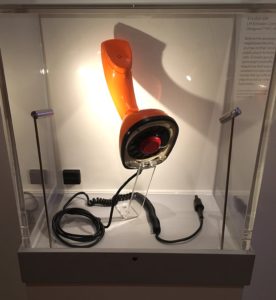
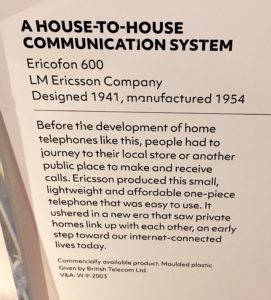
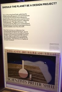
When the curators took the stage again to sum up, Rory reiterated the aim of the exhibition and symposium, “to talk about the future with real things today”, which is a refreshing change from so many future-focused events that deal with what-ifs. Mariana posed a final question, “what does it mean to discuss futures at the V&A?” acknowledging that the institution is never neutral. Although that was the end of the event, the question resonates with my investigation of the Museum’s role within the discourse of design. One element of interpretation within the exhibition certainly addresses that question; opening each zone a text panel poses a series of questions alongside an object from the Museum’s collection identified as an historical example of how a similar need or function was fulfilled in a previous era. The Museum is the repository of material evidence of historical problem solving and form giving when technologies, materials and industries differed from today. An exhibition of objects that were deemed innovative, ground-breaking and futuristic in their day, like the Ericofon 600, could reveal how previous versions of the future reflected the attitudes and expectations of an era. The question is what changes and what stays the same. Another theme might question the fetish for newness and unlimited progress that is so central to future-focused design and consumption, but which Walter Benjamin identified as a Sisyphean quest in the unfinished The Arcades Project. His concept of the “dialectical object”, an object taken out of its context, reconfigured and reinserted into another context so as to “expose the lie-dream of capitalism in a sudden, shocking image” (well explained by Stuart Jeffries in Grand Hotel Abyss: The Lives of the Frankfurt School) makes me think of the everyday object in the museum or the vintage/obsolete object bought from a flea market and given new life in a contemporary interior.
Back to the symposium; I applaud the diversity of expert speakers brought together within a design museum. Several identified as artist and researcher while employing what could be described as design methods producing designed outputs. As a design historian writing about design museums and considering how institutions, exhibitions and publications form the discourse of design, I was especially interested in the term “artist and researcher”. While I support extending the field of design history beyond any limited canon, I’m most interested in writing about the practice of design (perhaps that’s a version of historiography), and increasingly my students (of design) refer to themselves as artists. So, I’m beginning to wonder if the label “designer” has a future? Why the reluctance to use the term? Is it perceived as too commercial, and indebted to the Neoliberal agenda? Or does it reflect contemporary practice, with design as a consultative, speculative project, producing a future-focused report or an esoteric display rather than a “real” product? Coming back to the exhibition, The Future Starts Here; the fact that it featured real projects, whether defined as art, product design or ideas in development, presented an important truth, that finding solutions to present day problems is designing the future.
*By the way, the book was Future Present: Millennium Products from the Design Council (Booth-Clibborn Editions/Design Council, 2000), and as far as book design goes, the future in 2018 looks a like the future in 1999, in a light sans-serif font on fluorescent orange…
All photographs taken by Liz Farrelly, on an Apple iPhone SE.

